Design
The design of the tool is done really well since it meets both easy of use and effectiveness of the visualization. The tool is very simple and stable it never happend to me to crash. When zooming in and out the page the visualization remain consistent, there are no floating pieces in the window.The interface provides to the user very few commands which allows the user to effectively explore data without overwhelming him with possible options. The tool communicates complex ideas, such as the growth of a country, with clarity, precision, and efficiency. Data are represented on only six coupled dimensions, which provide a very interesting and effective way to see the data. The slider works well, and also the animation with interpolation of the shapes is a really interesting feature.
Despite the fact that the overall design is pretty good, there are two questionable points about:
Add Country
Adding a new country is a fondamental feature of this application. The transparent curtain implemented to allow the user to select the countries/continents is nice and elegant but not really convenient. I think that it should be integrated search through a keyboard with intelligent autocomplete. In this way the user saves time in searching for the specific country is looking for in the list.
However, the choice of adding features like this one is a trade-of between essentiality and functionality. The choice of the authors seems, thus, to be fair.
Despite the fact that the overall design is pretty good, there are two questionable points about:
- How add country option is managed
- How actual data are shown
- Index choice
Add Country
Adding a new country is a fondamental feature of this application. The transparent curtain implemented to allow the user to select the countries/continents is nice and elegant but not really convenient. I think that it should be integrated search through a keyboard with intelligent autocomplete. In this way the user saves time in searching for the specific country is looking for in the list.
However, the choice of adding features like this one is a trade-of between essentiality and functionality. The choice of the authors seems, thus, to be fair.
|
Data Interaction Data are separated from the main visualization. On the other hand, I'd prefer to interact with the visualization to see data while I'm comparing different countries, and not only in separate tables. |
|
Index Choice
Using standard measure to compare countries is a very nice choice. However, it would be nice for the user to choose the indexes. For instance, in the findings section, a coupe of topics might be in an interesting way by having more indexes. On the other hand, I have to say that this is a legitimate design choice, and it can't be properly considered a lack of features.
Using standard measure to compare countries is a very nice choice. However, it would be nice for the user to choose the indexes. For instance, in the findings section, a coupe of topics might be in an interesting way by having more indexes. On the other hand, I have to say that this is a legitimate design choice, and it can't be properly considered a lack of features.
Data
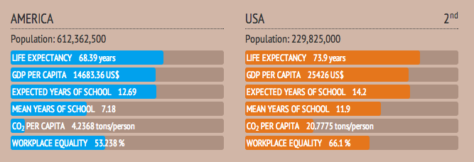
The use of standard indexes is a very wise choice, since it provides the user with consistent metrics. Discussed data are really interesting and furthermore they are really well documented. Shapes are represented with data which are quantified (even if not interactively) with clear and understandable units of measure. The only exception is the CO2 which is measured in different ways on the shape and in the tab. Furthermore it seems that the CO2 per capita is obtained for the continent as the average of its country, while of course it is not true. Data can be found here.
Another negative aspect is about the slider's quiet creepy unit of time measure, which follows this pattern:
From the 1980 to the 2005 there is an interval of 5 years between one set of data and the next one, while from 2006 to 2011 this interval is of 1 year.
This negatively affects the ability of the tool to effectively show changes in trend in the animation: if the increase of population in China, for instance, seems to be faster in early 80s with respect to 2010s might be due to a bad time axis instead of a real trend. It means that the animation doesn't necessarily tells the truth about the data.
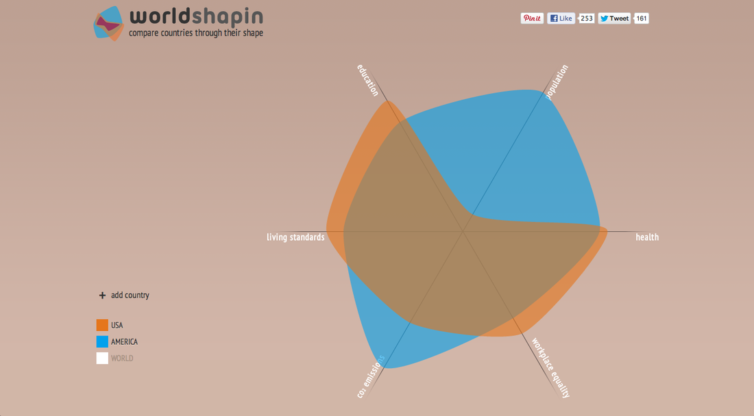
Also the proportions in the shape are not always really convincing. For instance, comparing America and Europe it finds out that the ratio of the population of the Europe with respect to the one of the America is 0.77, while in the shape it seems to be less that a half (see the figures below). We deduce than that data might be a little bit distorted by the shape design.
A further proof of this, is that, when compared to the world, shapes of countries tends to exfoliate and show bad things.
Another negative aspect is about the slider's quiet creepy unit of time measure, which follows this pattern:
- 19801985 19901995 2000 2005 2006 2007 2008 2009 2010 2011
From the 1980 to the 2005 there is an interval of 5 years between one set of data and the next one, while from 2006 to 2011 this interval is of 1 year.
This negatively affects the ability of the tool to effectively show changes in trend in the animation: if the increase of population in China, for instance, seems to be faster in early 80s with respect to 2010s might be due to a bad time axis instead of a real trend. It means that the animation doesn't necessarily tells the truth about the data.
Also the proportions in the shape are not always really convincing. For instance, comparing America and Europe it finds out that the ratio of the population of the Europe with respect to the one of the America is 0.77, while in the shape it seems to be less that a half (see the figures below). We deduce than that data might be a little bit distorted by the shape design.
A further proof of this, is that, when compared to the world, shapes of countries tends to exfoliate and show bad things.
About the Style
The style is very elegant. Colors are desaturated so that they looks more professional and easy on eyes. The background color is particularly characterizing for the application, and it is uniform under the plot and the rest of the visualization. The contrast between shape and background is good. Also the text is always clearly readable.
The Title used is really significant and, together with the logo, helps the tool in looking more professional and interesting.
The used font have been found out to be PT Sans Pro Narrow Light using this site. Changing font from standards is not always a wise solution, however, in this case it seems to be quiet appropriate.
More Considerations
Documentation

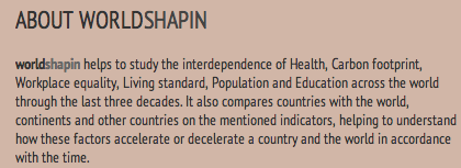
It is really well documented. The bottom of its page contains 400 words of description of the project enriched with links to numerous sources.
It is a very important feature for any visualization tool, and in worldshapin it is done really well.
Good initial data
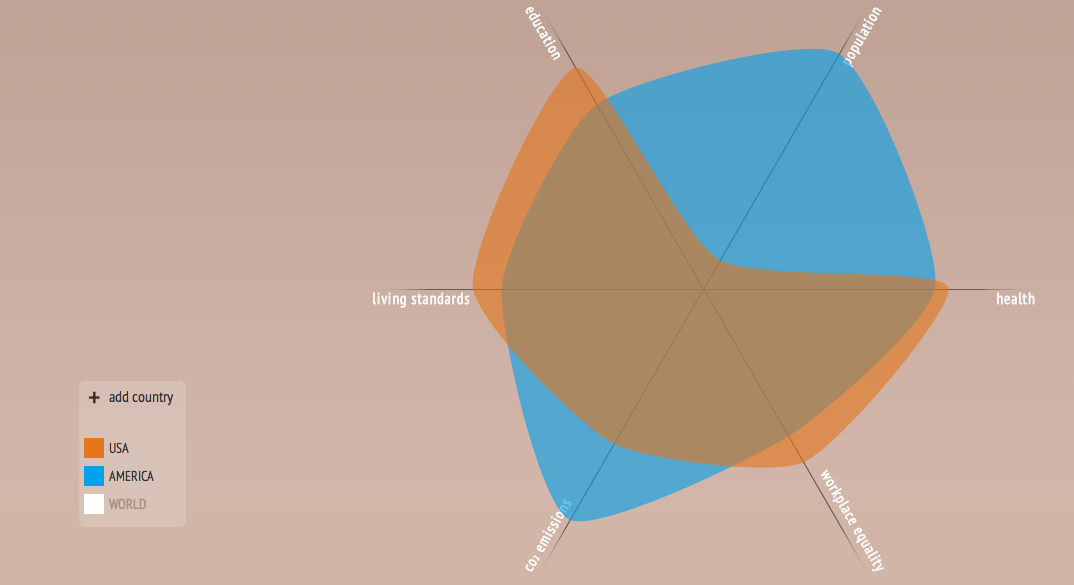
The visualization is initialized with a very powerful and interesting example. When a new user enters the site by default it is visualized a comparison between USA and AMERICA (the whole continent). This immediately shows the power and the usefulness of the tool.
Scaling
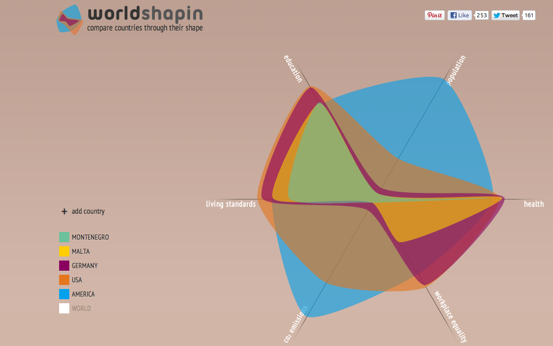
The application scales very bad increasing the number of the countries. At 5 countries the visualization begins to be incomprehensible. The application provides two features to overcome this problem:
- Transparent shapes
- The shape is outlined while going with the mouse over the name of the country
Forming and Breaking up Countries
Forming or breaking up countries are not considered at all. This might result in wrong analysis by the user when considering countries such as Germany or Russia.
